Tuesday 31 May 2011

A Different Curtain

Here's the finished painting:

A Different Curtain


I hope you've enjoyed the process and the finished painting. :) 
Tomorrow I'll be visiting all your blogs, for tonight, its time to water the garden. 
Have a wonderful evening, all xx

Monday 30 May 2011

A Different Curtain - work in progress 2

here are the next three stages of A Different Curtain.

I've added the foliage here, behind the figures and have finished the bricks in the wall


In this one I have added the first pale green wash to the figures, made from a mix of ultramarine and transparent yellow. This is a base for the stronger colour to come.


and in this one, I have added the first wash of viridian, which will give the statue  a look of aged bronze.


The next picture you see will be the finished painting, because its just a matter now of adding another wash of viridian and touching up the shadows, where they need it. Oh, and deepening the pale red marble on which they sit. :)

Until tomorrow, then... 

Sunday 29 May 2011

A Different Curtain - work in progress

Its a long time since I showed you a Work In Progress, so today the camera came out and I am recording the steps, for you to enjoy.

the photo came from Morguefile and is of the Jim Henson Memorial

As I drew this, I was humming the Muppet tune, "its time to put on make up, its time to light the lights, its time to raise the curtain on the Muppet show tonight."

So the name came to me of " A Different Curtain" because that's what Jim and Kermy are raising now.

On with the painting.. after the drawing, I painted the shadows first!


and then I put a wash of yellow ochre over most all the painting. This will help make it a cohesive whole - and will also help to make the wall behind recede.


I'll post more as I progress. 
Hope you are all enjoying your Sunday :) xx

Thursday 26 May 2011

The Alphabet Paintings: M

So, I've reached M in the alphabet..

and there could only be one painting, or I'd never be forgiven :)
I tried to paint her in a more painterly, softer approach and whilst I'm satisfied, I'd still be pleased to hear your opinions and critiques. 

M is for Missy


She'll also be added to my painting website HERE
Enjoy browsing :)

Monday 23 May 2011

Evolution

If you scroll down to "Raw Cider" you will see a set of thumbnails.
This painting used thumbnail number 2 as a basis.
I wanted to try a minimalist style.
This is how the book Realistic Abstracts is encouraging me to think.
Remember, it had no demos... so you have to construct your own paintings.

All of my paintings can be viewed on my website HERE at any time. 
If you enjoy browsing, feel free to leave a comment on my Guest Book.


Evolution


Sunday 22 May 2011

Sunday Sport

This painting came from one of the thumbnails in the previous post :)
I thought I'd have a little fun with it.

Sunday Sport


So I took two leaves from the garden and impressed them into a wash of new gamboge. When they'd made an impression I dropped a couple of drops of French Ultramarine in the still damp wash and let that do its thing.

In the meantime in the tree I had scrunched up some cling film. When that was dry it left wonderful texture marks. I then laid a wash of burnt sienna. When that was dry, I ran some candle wax over the tree trunk and then laid in another wash of burnt sienna. When that dried I used a dry brush technique with warm sepia - and this is a close up of the end result.

I had such fun making this, laughing to myself as I painted.
I hope its made you smile too :) xx

Friday 20 May 2011

Raw Cider

Its the monthly challenge time of the Painting Friends Forum.. and this month's challenge was a still life.

So here I am showing you all the thought processes which went on behind this painting. I don't usually write all this down, but the judgements are made before any painting starts. Planning can be useful, as I found out when trying out the realistic abstracts. More chance of a successful painting if you know where you are going with it.


Firstly I set some goals for my thumbnail sketches.

These were :
  1. do a thumbnail showing the scene as is
  2. on the next two thumbs, change the background and foreground to remove clutter and try to contour draw too
  3. on the last thumbnail, keep the focal point, but be completely off the wall in the scenery
  4. Choose which one of these thumbnails to paint.


Choosing (2), the choices for the painting were to try to

a) paint in a tight style
b) or a loose one

I chose to paint the scene (b)
I wanted to achieve a painting that had a cohesive mix of broad strokes and realism.
I also wanted to test out some colour choices so did this very rough colour sketch:

So, here's the painting:


Raw Cider


What works and what could be improved.

I think the apples work, and the background too..
What could I improve? Probably the folds on the cloth, they are almost pointy.. if I did it again, I'd make them more curved - that has a softer appeal.

Challenges Faced


The challenge in painting this was to leave the background alone once painted and let the rest of the painting form around it.

Share Personal Goals and whether you felt you Met Them

My goals were to make the four thumbs again, to test out some colours on a small piece of paper and then to be as bold and decisive as I could in one stroke with everything but the apples.

I did meet that, after deciding that I wasn't going for an exact replica of the cloth – more a feeling of it.

How I created the Painting.


I created the painting by wetting the background first and making several one stroke passes with a 1in flat brush.

Then I made one stroke passes for the cloth, using the flat brush, both flat and on its side for the thinner stripes.

The apples were made with thin washes one after the other. The farthest having fewer washes and the nearest having the most.

Size of Painting, Medium, Palette and Brushes.

The painting is on Arches Aquarelle Rough 140lb and is quarter sheet. 15”x11”

The medium is pencil for the under drawing and watercolour for the painting. W&N artists quality .

Palette colours used : French Ultramarine, Alizarin Crimson, Cadmium Red, Aureolin, Burnt Sienna, Winsor Yellow, Sap Green, Terre Verte and Cerulean.
Brush: Sceptre Gold 1” Flat brush. Kolinsky number 12

Tuesday 17 May 2011

I'm nearly famous now!

One of my lovely blog friends Arianna, recently asked if she could use one of my photos of Missy, for artistic purposes.

Of course, I gave my permission, and Missy was delighted to have a new fan! :)

Go HERE to Arianna's blog to see what she created.

She's done a great job!

What's that you say? I'm nearly famous now?

Monday 16 May 2011

The Gift.

Yesterday I carried on down the abstract route.
I simplified a vase and flowers by making a contour drawing.
That is, an outline drawing of the edges of the flower mass and the edges of the vase. That's all.
Then I studied shadows and colour and simplified them.
This is what I came up with:


The Gift


Sunday 15 May 2011

Trying out the abstract

A post or so back, I showed you a new book I'd bought, called Realistic Abstracts.

Its a step away from the usual art book I'd buy.
That's because it deals with abstraction - and there are no demonstrations in it!

That's right, no step-by-steps ! More, these are the elements of a realistic abstract, see how it works in these sample paintings.

I was attracted to some paintings, repelled by others. That I would imagine is perfectly normal.

So, we learn from this book that simplification is an important element. Removing all that is unnecessary clutter in a painting.  Then to give a suggestion of the subject.     

I really like this book - after the initial shock on no demos, it has given me rise to think!

So I've been practising, thinking and painting..  here we go with my realistic abstract journey... please feel free to comment whatever is in your heart..complimentary or not... I don't mind! This is all learning for me.

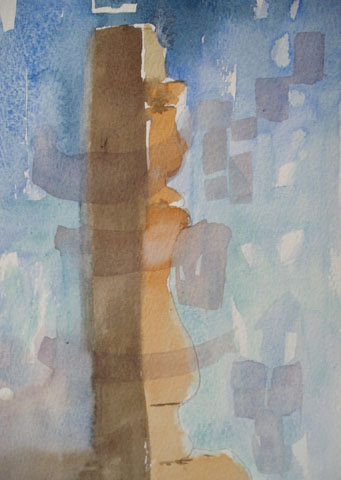
First, trying to show a candlestick and the woodturner's art.
I think perhaps I attempt too much on this effort!


Next, a very simplified scene - just colours to hint at shapes


thirdly, I tried to follow a photo in the book, because this one attracted me :)
This is the style of realistic abstract that I like so far..


Then I tried to simplify the Easter Island head I have in my garden.
It feels too "blocky" and severe for my liking, but I show it anyway. We learn from everything, yes?

and then, I painted this with no idea in my head. Just left some whites and then added colours in random shapes. When I finished and stood away from it, it surprised me to see a dog looking back at me.. as if I had disturbed it from sleep.

Lastly I took some bright colours - just three primaries and again left white spaces. This looks so bright and fresh and it puts me in mind of the artist Nil Catalano. Nowhere near as good as his work, but for a first, I am happy with it.


If you would like to follow Nil's blog, it is HERE

Today I am going to try my hand at a vase of flowers, and I will post the result tomorrow.

Friday 13 May 2011

Even Solomon

Here's the painting of the lilies that I drew.
Its been ready to post since Friday, but due to blogger issues, I couldn't post it.
I'm also sorry to say that some of your comments have been lost in the blogger troubles and when I tried to re-publish from the email, it told me your comments no longer existed.  Sorry about that . Hopefully we're back to normal now.

Even Solomon.


As always, this will be added to my gallery site:  Pat Elliott Paintings
where you can find all of my paintings easily.

Thursday 12 May 2011

Drawing Lilies

Thanks to Sharon and Mora over at Painting Friends, we have a section called "Drawing Corner"

This month they explained negative shapes, gave us many examples and provided reference pics for us to practise on.

I thought you'd like to see my practise pieces.

First, the negative spaces


then lightly drawing in the flower


and finally - the finished drawing.
I will be painting this :)


oh and if you have never seen Sharon's blog, you're in for a treat - HERE
and Nora's blog - just as fabulous - HERE

Tuesday 10 May 2011

In a comfy chair

The end of the financial year has come and gone, which means I am currently working on my tax returns (being self employed) .
Its a chore, but a necessary one.

I have managed to do a bit of online book shopping though - and this is what I've bought!

After completely the last painting, where I learned that feeling was just as important as technique, if not more so.... I searched for a book which would help me learn to express my feelings about what I'm painting - and this one seemed to fit the bill.  So after figures, I'm sitting down to read in the most comfy chair in the house :)
Sometime in the future you may see some abstraction from me :)

Missy, of course, is not impressed by taxes or books.. you can almost hear her thinking "what shall I get up to next?"

Friday 6 May 2011

After Kahlo's Love Embrace


For this Paint like the Masters challenge, I chose to paint a section of Kahlo's "Love Embrace"

Paper

For this painting I swapped from my usual Arches Rough to Bockingford Not.
That's because Bockingford won't fizz colours as easily as A.R, which seemed more suited to what I could see as Frida's style.

Challenge

I've not heard of Kahlo before and when I found her paintings, I wasn't really attracted to her style. It almost seemed too heavy handed for me, if not in technique, then it was in intent.
So the challenge for me was to find something in her painting I could relate to - and I found it in "love embrace"
Then I had to try to paint watercolours slightly "heavier" than I would normally.

Conclusion

I found that in "Love Embrace" I could relate to the intent of universe holding us and us holding that which we cherish. More specifically in the old dog being held.
I've tried to paint with more feeling than technical brilliance ( if I ever had that!)

Looking at this painting close up I'm ok with it, looking at it from four or five feet away, I love it .
You don't see the strokes, but you definitely catch the feeling.

So, I'm quite glad I did this.. again its taught me something new. Feeling can be felt over technique.. and that is worth a great deal .

Wednesday 4 May 2011

Portrait practise

Mollie kindly let we Painting Friends use one of her photos to practise painting child portraits.
So off I gaily went and this was the first effort I showed the friends:


after a few suggestions on how I could make a few changes to bring her more to life and have more shape and form on her face, I came up with this:


I'm quite happy with the changes and I'm grateful for the help this novice receives!

Monday 2 May 2011

Strawberries a la Mollie

Mollie Jones, bless her heart, gave us all on Painting Friends a demo on how to paint strawberries. Mollie is just the queen of painting reds!

Have you ever seen Mollie's blog? If not, go HERE and you're in for a real treat. She's such a lovely artist and so helpful to learners too !

If you'd like to join Painting Friends, go HERE and tell them you came from my blog.

and here - my version of

Strawberries a la Mollie


Related Posts with Thumbnails