Showing posts with label year of painting. Show all posts

Tuesday, 20 March 2012

Year of Painting, Self Portrait.


Over at Painting Friends, its the last of the Year of Painting

Number Twelve, Self Portrait

Personal Goals for this Painting:

The goals were for me to make four thumbnails again and paint all four, finishing this year of painting with a flourish.

Here are the four thumbs.


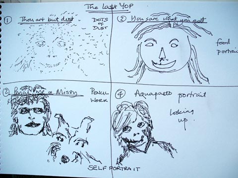
After I finished these, I thought I'd start with the pencil portrait as that would undoubtedly take the longest. The basic shapes were there when I thought, ah, go on, paint this one. So I did.
When it was finished I called it “Prime Time”

Prime Time


Challenges Faced
Painting the portrait came quite easily, especially because I had chosen to be quite kind in my depiction. Near the end I started to get emotional, as I always do with my dog portraits when I think I have the likeness. 

Then the name popped into my head “Prime Time” and I got really upset. 
 I'd chosen a double portrait, me and my dog, because I am really uncomfortable with painting myself alone. 
It struck me then that this photo was taken in our prime time, that for both of us there was more behind than there was ahead. 
That realisation brought me up short and I was choked.
I put the painting in my folder and I couldn't paint any more of the thumbs.

Share Personal Goals and whether you felt you Met Them
My goal was to make all four thumbs into paintings.
The emotion of painting Prime Time put paid to that, so no, I didn't meet my goals.

How I created the Painting.
I had a line drawing to begin with.
Then I started by painting myself as the background figure, followed by Missy in the foreground.
Not photorealistic, but reasonably realistic. I didn't bother with wrinkles, sure I didn't see any!


Size of Painting, Medium, Palette and Brushes.

The painting is on Arches 140 Rough 11” x 8”
The medium is pencil for the under drawing and watercolour for the painting.
W&N artists quality paint.
Palette colours used : yellow ochre, aliz crimson, permanent rose, french ultramarine, sepia, burnt sienna, cad red.
Brushes: round 12, round 6, round 2.

Monday, 20 February 2012

Year of Painting, Grapes.

on the Painting Friends forum we're on the eleventh of the twelve monthly paintings for our year of painting. (YOP)


Year of Painting (YOP)
Number Eleven, Grapes

Personal Goals for this Painting:

to paint the reference photo and paint as reasonably realistic without adding my own particular inventive stamp to it.
After having made up my own still life in the last YOP, which was such a high, painting a given subject felt almost anti-climactic. I honestly felt like I'd run out of steam with this YOP.


Summer in France


Challenges Faced
The main challenge I felt was motivating myself to paint this one.
I decided to try a three colour swish background to this one and take it from there.
I added an extra bunch of grapes to the lower part of the painting, because I didn't want to paint the exact photo – and I left out some leaves and another bunch from the left hand side.


Share Personal Goals and whether you felt you Met Them
My personal goal was to make the painting when I in no way felt creative about it.
This I did – and then something wonderful happened.
The very next day after it was finished, I looked at my end painting and thought, I wonder if I could make that loose?

So I sat down with a quarter sheet of paper, reminding myself this is cheaper than a Costa Coffee and much more fun and I set to play. I really didn't know or care if I'd have a finished painting worth showing at the end.
Did I play? Yes I did. Here is the result, you can decide if it was worth showing you.

Fruits of the Vine


How I created the Paintings.
Summer in France – I'll show you in pictures!


Fruits of the Vine - two pics, the first was big brush dollops of wash placed roughly where the colours would be, then using a spray bottle to push the paint around. Left to dry, it looked like this.


After adding some loose-ish detail, it looks like this!

and here is where I confess, my sternest critic helped me with the painting of Fruits :) 


Size of Painting, Medium, Palette and Brushes.

The paintings are on Arches 140 Rough and are Summer, 12x11, Fruits, 15 x 11
The medium is pencil for the under drawing and watercolour for the painting.
W&N artists quality paint.
Palette colours used : transparent yellow, aliz crimson, french ultramarine, sap green, sepia.
Brushes: round 12, round 6, round 2.

Tuesday, 20 December 2011

Year of Painting, Rose.

On the Painting Friends forum, its time for the Year of Painting. This month we had a white rose as a reference to work from.
The idea of painting once a month is for you to analyse your work and grow from the experience.

Today, I thought I'd share the whole post with you, not just the final painting, as I did with V: The Other Side of the River.


Year of Painting (YOP)

Number Nine, Rose

Personal Goals for this Painting:

Firstly I set some goals for my thumbnail sketches.
These were :
  1. do a thumbnail showing the scene as is.
  2. on the other thumbs, show different crops and ideas
  3. Paint all four thumbs.


I chose to paint all four thumbnails. Why I did this was to push myself to get more out from these YOPs. To try each technique and crop. To find something in each I could like and learn from.

So, here are the paintings:

Dark Rose 

 
8 x 11 Arches 140 Rough
I changed the colour of the rose. Solely because I'd not long since painted a white rose in “The Shadow of Your Love.”
I like this rose in parts. I love the bud and the background and leaves. Also the outer petals of the rose, but I feel I made a mistake to paint all the petals because I feel I've lost it in the inner shadows. I've painted in glaze after glaze to give a richer colour, therefore I can't lift the shadow without ruining the petal. A lesson learned – plan more if you want to be that literal and paint your shadows first!

Christmas Rose


8 x 11 Arches 140 Rough
Love the richness of this impasto version, it feels like a oil. That's probably because for the first time, I've painted it completely with a palette knife.
Its taught me that although its ok as a small painting ( 8x11 ) it would be stunning as a large, full sheet version.

Rosebud


8 x 11 Arches 140 Rough
This , I love everything about it. Lesson learned, take an element of a photo, that really suits me better than using the whole!

Sweet Rose


8 x 11 Arches 140 Rough
I love pointillism, it feels like meditation to me when I work in this way. Love the way this came out, reminding me of a sugar frosted rose. I wouldn't change it at all, I even like the way the petals have different colour variations.

Challenges Faced
Painting all four thumbs and trying to be creative with them all. Hardest of all was to paint the “as is” thumbnail, when it was never a photo I'd have chosen for a reference.


Share Personal Goals and whether you felt you Met Them
My personal goals were to be creative in all four paintings and to learn something from each, which I have done in varying degrees.

How I created the Paintings.
Multiple glazes in Dark Rose on the rose. Some negative painting in the background.
All impasto using aquapasto as well as watercolour and a palette knife in Christmas Rose
Loose background wash for sky in Rosebud and merging wet in wet washes for the rose and shadows.
All pointillism in Sweet Rose. A dot at a time. It took the longest time of all.


Size of Painting, Medium, Palette and Brushes.

The paintings are on Arches 140 Rough and are 8” x 11”
The medium is pencil for the under drawing and watercolour for the painting. (addition of aquapasto for Christmas Rose only)
W&N artists quality paint.
Palette colours used : transparent yellow, cadmium red, french ultramarine, sap green, olive green, indigo.
Brushes: round 12, round 6, round 2. palette knife.

Hope you've enjoyed this peek into my thoughts and practices.

Thursday, 20 October 2011

Reflecting on Bygone Times, Year of Painting

Over on Painting Friends, its Year of Painting time again, so I thought I'd share the whole post with you, so that you can gain an insight into the workings behind this painting :)

Number Seven, Auto Reflections

Personal Goals for this Painting:

Firstly I set some goals for my thumbnail sketches.
These were :
  1. do a thumbnail showing the scene as is
  2. on the other thumbs, show different crops and ideas
  3. Choose which one of these thumbnails to paint.


Choosing (4) Rusty Wreck, the goals for the painting were: try to show a vehicle in a stage of decomposition and by doing so describe the impermanence of life and material objects.
To this aim, I also wanted to incorporate the acrylic technique of painting a ground onto watercolour paper. This means adding a tint of colour and texture before you start painting proper.


So, here's the painting: Reflecting on Bygone Times


What works and what could be improved.

I'm pleased with the overall feel of the painting. By the grasses I should have left more lights, as I did with the sky.

Challenges Faced

The challenge faced for me was incorporating tinting and texture onto the paper before I painted the car.

Share Personal Goals and whether you felt you Met Them

My goals were to make the four thumbs again, pick one to paint, namely Rusty. I wanted to use the acrylic ground technique to see what difference it would make to the overall feel.
Did I manage that? I think so, though I can see that completely tinting paper wouldn't have suited this subject, but it does tie car and shrubs in so they feel at home together. I don't think I should have extended it to where I painted the grasses. I think it dulls the grasses too much.

How I created the Painting.

I created the painting by painting the sky first. When dry, I scumbled a mix of burnt sienna, raw sienna and light red over the rest of the paper. Then I pressed cling film into that so that when dry there would be some texture. After that the shrubs were painted in a loose random style, made of shades of raw sienna, burnt sienna and cadmium yellow pale. The car was painted in cad red and cad yellow pale, with the rust and bullet holes being painted in various strengths of a shadow mix ( ultra and crimson) Grasses were painted in a loose style using a large flat brush, using the same colours as used throughout, with the addition of a making a green from ultra and cad yellow pale.

Size of Painting, Medium, Palette and Brushes.

The painting is on Arches 140 Rough and is 15” x 11”
The medium is pencil for the under drawing and watercolour for the painting.
W&N artists quality paint.
Palette colours used : Raw sienna, burnt sienna, Cad Red., Cad yellow pale, French Ultramarine, Alizarin Crimson, light red.
Brushes: Flat 1”, round 12, rigger 2

Thursday, 22 September 2011

Wintry Day - the year of painting.

Good morning all.

Over on Painting Friends we've recently done another in our year of painting set.
Each month we have a photo reference set for us and we interpret it in our own fashion.

This month was a lady cardinal, a bird not native to the UK.  I was a trifle concerned how I would cope with painting something others were very familiar with and me not at all !

The original photo had the bird sitting on a branch and lots of other branches and the tree trunk visible. I decided to remove all of those and just paint the bird with one snowy branch and a very wintry background.

I hope you enjoy the painting and if you have any questions on how I did it, fire away! I will do my best to answer :)

Wintry Day


This and all my other paintings are together on my permanent gallery site HERE   Do go over and have a browse - and enjoy :)

Saturday, 20 August 2011

Hypnotised - the year of painting .

We are into month five on the Painting Friends Year of Painting.

This is where you get to see all the thoughts, hopes and execution of a painting.
Enjoy :)

Number Five : Ocean

Personal Goals for this Painting

Firstly I set some goals for my thumbnails
These were:

Do a thumbnail showing the scene as is 1
On two thumbs eliminate different elements 2,3
On one thumb, be off the wall. 4
Choose which one of these thumbs to paint


Choosing 3 , I decided to paint the scene as an oil, using watercolour and aquapasto medium, and using impasto techniques.


So here's the finished painting

Hypnotised


What works and what could be improved.


I'm pleased with the feeling of oil, but because I still reserve white, I think the white of the breaking wave could have been improved. I need to go watch some waves break to improve my observation.


Challenges Faced


Painting a wave from a photo – without lots of real life observation. I need a sea trip!


Share Personal Goals and whether you felt you Met Them


My goals were to make the four thumbs again, pick a technique for painting, namely impasto.
Did I manage that? I think so, though I can see room for improvement.


How I created the Painting.


I created the painting by painting the wave first. A few different colours and strokes, then scumbling along the crest of the wave to give a foam effect. Dry brush for the foam on the shore and simplified figures, with just shadow and light. Sand was yellow ochre and a little sepia too.


Size of Painting, Medium, Palette and Brushes.


The painting is on Bockingford 140 Not and is 15” x 5”
The medium is pencil for the under drawing and watercolour and aquapasto for the painting.
W&N artists quality paint.
Palette colours used : French Ultramarine, Indigo, Yellow Ochre., Sepia.
Brush: Kolinsky numbers 12 and 7


Wednesday, 20 April 2011

The process behind a painting

On the forum I belong to - Painting Friends - we are having a "Year of Painting" Challenge. We paint one picture a month, and the photo is one we all use.
When we take part, there are certain things to hold in mind about what you did, what you liked ...etcetera.

So here, for anyone who has five minutes to spare in reading, is the process I go through whenever I make a painting.

Year of Painting (YOP)

Number One, Landscape.

Personal Goals for this Painting:

Firstly I set some goals for my thumbnail sketches.
These were :
  1. do a thumbnail showing the scene as is
  2. on the next two thumbs, change the ratio of sky to ground and remove anything which clutters the focal point
  3. on the last thumbnail, keep the focal point, but be completely off the wall in the scenery
  4. Choose which one of these thumbnails to paint.


Choosing (4), the choices for the painting were to try to
a) paint in a realistic style
b) or not.

I chose to paint the scene (b) 

I wanted to achieve a surreal feeling to the painting – a dreamlike state, as one who looks back on their past and remembers it, but not warts and all.
I already had in the back of my mind from the thumbnail stage that this would be The apple tree - the Tree of the Knowledge of Good and Evil.. and that the distance would be indicative of how far separated we are from Heaven.

So, here's the painting: The Distant Hills of Youth


What works and what could be improved.

I love the green grass in this painting – it is completely flat in colour, with no graduations and the only shadow that of the tree. This to me is what gives the painting the slightly surreal feel – because no grass would be quite that shade of green or that perfect. 

The sky! This could be improved.. I feel if I did it again I would make the sky bluer and the water bluer. I like the way they are now, and the way they meet on the horizon - but if its a dreamlike scenario, it ought to be bluer.

Challenges Faced

The challenge in painting this as a surreal rendition was not to paint as if it was realistic.

Share Personal Goals and whether you felt you Met Them

My personal goal was to make this a painting of a dream remembered landscape.. one that showed how far away the viewer had grown from Heaven. The hills are a way away from the tree, so I do feel I met that goal – and also the goal of making the landscape surreal.


How I created the Painting.

The sky was painted by dampening the sky and water area and then running in a wash of ultramarine in the wet area.
Distant land was created by making a wash of ultramarine and crimson . Washing over the whole land mass on the first wash, on two thirds on the second wash and on one third for the third wash.
Grass was painted by mixing cad yellow and cobalt blue and painting wet on dry.
When that was dry the tree shadow and the small shrubs were painted in a stickier mix of the two colours, plus a touch of indigo.
Rocks were all variations of raw sienna/burnt sienna and ultramarine, all painted so they merged in a random fashion. The foreground rocks had some dry brush too, as did the reflections in the water.

Size of Painting, Medium, Palette and Brushes.

The painting is on Arches Aquarelle Rough 140lb and is quarter sheet. 15”x11”
The medium is pencil for the under drawing and watercolour for the painting. W&N artists quality .
Palette colours used : French Ultramarine, Raw Sienna, Burnt Sienna, Cadmium Yellow, Indigo
Brushes, Kolinsky, sizes 8 and 3, Sceptre Gold 1” Flat brush.
Related Posts with Thumbnails